 Login
Login
Evan Herman Professional Philadelphia Freelance WordPress Solutions
-
WordPress Consulting
Launching a new business or just a personal site, but have no idea where to begin? I’ve launched numerous websites ranging from small business sites to personal blogs and portfolio sites.
With my expertise, You’re in good hands. I can provide insight to some of the best plugins, themes and some of the best things WordPress has to offer saving you countless hours and money.
Learn More[/tab_content]
-


Rapid WordPress Services

-
Development
Whether you’re looking for a custom WordPress child theme or a completely customized WordPress theme, I can help by writing clean and SEO-friendly code that will build your web prescience in no time. Need the site up fast? I can build you a complete site, from PSD to functioning WordPress theme in 5 days or less.

-
Maintenance & Support
Stop worrying about your website, and start worrying about what matters. Maintenance plans offer top quality support with minimal impact on your site. Before any major updates, I’ll make sure all of your plugins and your theme are compatable with the newest core version. If not, I’ll look into what needs to be done to make sure things play nicely.


-
Custom Plugin Development
I have been developing custom plugin solutions for 3+ years now. Whether you’re looking to integrate a third party API into your site or build in custom functionality into your existing site, my custom plugin solutions will get the job done. Plugins are completely tailored to the feel and need of your specific site.

-
WordPress Development, Done Right.
- Let’s Get Started
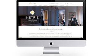
Recent Works


-
Our Happy Clients
I believe in developing and maintaining an ongoing relationship with my clients. It doesn’t matter if it’s a one off job or ongoing work, I won’t just disappear.
-